Pantone Spring 2018 Color palette has a lot of variety. In the same fashion, the colors showcase an appreciation of complexity as well as a distinction of color.
Pantone Spring 2018 Color Forecast
Since we’re continuing to see a crossover in fashion; the color palette embraces gender and seasonal borders. Visit my Gender Fluid Fashion Trend Happening post to read more androgynous fashion styles. As we continue to see many colors and styles on both sexes; we’re seeing this translate each season into ways to express ourselves.
Pantone Spring 2018 Color Report for New York


As a result of individuals seeking more variety; the Spring 2018 color report embraces the gender neutral future of fashion.
- Meadowlark – Indeed, this is a bold and lively color. Hence, this color is a bright yellow shade that shows joy and illuminates the world around us.
- Cherry Tomato – No doubt, this color demands attention. In addition, Cherry Tomato is an orangey-red that exudes energy and heat.
- Little Boy Blue – Of course, this color isn’t only for boys. When you look up at the sky; you hope to see clear blue.
- Chili Oil – Are you looking for something to add a pop of color? This reddish-brown adds something unique to your style this Spring.
- Pink Lavender – This is a soft and romantic color that brings peace and serenity.
- Blooming Dahlia – With a hint of suggestion, this color blooms with appeal.
- Acadia – In the same fashion, this shade of green hints at retro, yet is modern. This color takes on a different appeal for the Spring season.
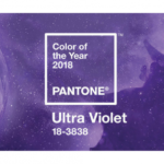
- Ultra Violet – Visit my Pantone 2018 Ultra Violet post for more on the color of the year.
- Emperador – This rich chocolate infuses strength to the Spring 2018 color palette.
- Almost Mauve – Moreover, this color is a flamboyant shade of Fuchsia.
- Lime Punch – Like Meadowlark, this color hits a note with its striking citrus presence.
Spring 2018 Color Classics
Since many of us like basic core colors; Pantone has included some classic colors for Spring.
- Sailor Blue – In my opinion, navy is always a nice boost to your Spring and Summer wardrobe.
- Harbor Mist – A mid-tone gray that is a nice color to pair with many pop colors.
- Warm Sand – Since everyone has a neutral; this color is a mainstay that transitions season-to-season.
- Coconut Milk – This color is a classic white to off-white shade and easily transitions season-to-season.
Spring 2018 Color Report – London
So, the London color report is similar to New York with a few exceptions.
- Palace Blue – Similarly to Little Boy Blue; this color sparkles with energy.
- Ash Rose – This color is a muted pink that is classic, yet modern.
- Nile Green – In addition, this color is calm and composed. Also, this color blends well with many of the other colors on the palette.
- Rapture Rose – Ultimately, similar in color to the Almost Mauve on the New York Spring 2018 Color Report.
- Almost Mauve – Another classic, yet gentle color that brings balance to the color palette.
Conclusion
There you have it – the Spring 2018 Color Report.
As always, I welcome your comments.