Pastels are Pantone’s 2016 Colors of the year. With national politics heating up, experts at Pantone Color Institute were angling for more gentle tones.
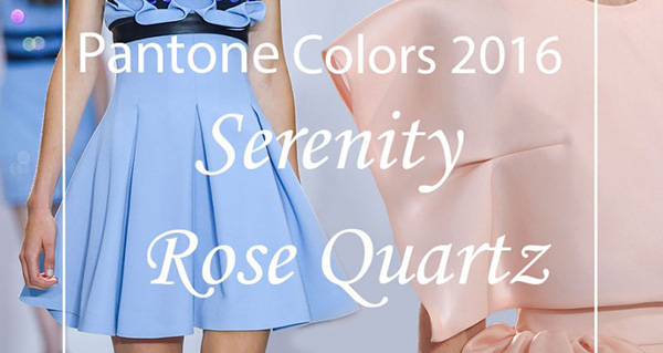
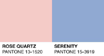
Rose Quartz (light pink) and Serenity (light blue) were recently selected as colors of the year.

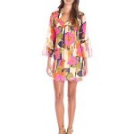
What I love about Rose Quartz and Serenity as they can be paired separately or blended as shown above. Pantone searches for trends when selecting the colors of the year. Both the East and West Coasts have been trending with pastels.
Pastels
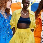
The top ten pastels that were showing up on the runway in both men’s and women’s fashions are:
- Rose Quartz
- Serenity
- Peach Echo
- Snorkel Blue
- Buttercup
- Limpet Shell
- Lilac Gray
- Fiesta
- Iced Coffee
- Green Flash
Colors as above are leaning towards a trend of calming. The world of Art and new Global trends have Designers leaning towards softer colors. These colors pay homage to the beauty of nature. The Spring and Summer collections showed designs in tranquil and mindful emotions.

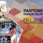
Many Designers used these colors to transport us to a happier and sunny place. The Design on the runway shown above incorporated many of the 2016 colors.

The soothing colors this year are led by Serenity. In particular, Serenity is a color weightless and airy. It is a color that expands the blue sky. The name Serenity leads us to a calm and soothing time. It transports us to a place of a natural connection of space.
Rose Quartz led the Spring and Summer collections. Rose Quartz is a gentle color that conveys compassion and composure. Together with a sunset this color leads to serenity. By and large, the color reminds us to think of our surroundings in a lighthearted way.
In essence, all of the pastels have one thing in common. The colors focus on a desire to breathe, reflect, and play. These colors were used both in the Men’s and Women’s Fashion Designs.
In addition, the colors are subtle yet soothing this year. In essence, I am a fan of the colors chosen for the year. Of course, these colors, in particular, can be worn as a focal point or accent piece.
What pastel colors will you be wearing? In conclusion, what do you think about Pantone’s color of 2016?