Pantone has released their 2017 Spring Summer color report. Since this was a year of imagination, the colors are bright and vivid. In the same fashion, this years number one color for the 2017 Spring Summer season is greenery.
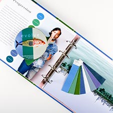
2017 Spring Summer Color Report
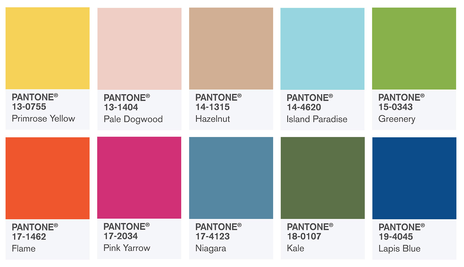
Primrose Yellow
Primrose yellow sparkles with heat and vitality. Also, yellow promises a bright and cheerful day. In addition, yellow invites warmth into a style or room.
Pale Dogwood
As well as some of the other tranquil colors, pale dogwood is a light pink shade with a glow of innocence about it. In addition, the soft shade exhibits a healthy glow.
Hazelnut
So, hazelnut is a key neutral for the spring and summer season. Hazelnut brings an earthly quality and brings warmth. Also, hazelnut is a good transitional color from season-to-season.
Island Paradise
Island Paradise is a blue-green color that wants to take us away to a great destination. In addition, island paradise is a refreshing color for a change of scenery. Additionally, this color brings us to a place to unwind.
Greenery
Greenery is the color of the year. Last years colors showed hints of green so it is not a surprise the color of the year is all about Greenery. Moreover, it brings a refreshing yet experimental flavor. In addition, greenery has you relax and take a deep breath. Also, this color brings you to a place you want to explore and experiment.
Flame
In the same fashion, flame is a fun and electric color. Of course, this shade brings heat to Pantone 2017 Spring Summer color report. When you think of fun and excitement, flame comes to mind.
Pink Yarrow
When we think of something festive and bright, pink yarrow comes to mind. Pink yarrow pops. Also, the color is vibrant, exciting and gets your adrenaline flowing. In addition, this color is fun and gets the party started.
Niagara
When we think of the Spring and Summer season, Niagara comes to mind. Niagara is classic, dependable and comfortable. Also, when thinking about this color, denim comes to mind. Of course, denim is comfortable and relaxing.
Kale
In the first place, when you think of health and being outdoors, kale comes to mind. Kale has us thinking about nature. When I think of kale, “healthy” immediately comes to mind. Although this color is similar to greenery, it isn’t as bright. Kale is the perfect background color for greenery. Additionally, it has you thinking about getting outside and exploring nature.
Lapis Blue
Of course, lapis blue is one of my favorite colors. Not only is it bright, but the color is also strong and energetic.
Conclusion
So, there you have it – the 2017 Spring Summer color report. Although some of the colors come across more subdued, there is plenty of pop colors as well. In conclusion, optimism and confidence come across in the 2017 Spring Summer color report.